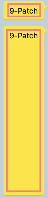
안드로이드 스튜디오로 제작한 나인패치(9-Patch)를 이용해 말풍선 만들기
Updated:
목차
- 나인패치(9-Patch)의 역할
- 나인패치(9-Patch) 이미지 생성과 영역 지정
- 활용
- 마무리
1. 나인패치(9-Patch)의 역할
나인패치의 역할을 가장 쉽게 이해하려면 우선 우리가 흔히 쓰는 카카오톡 말풍선을 생각해보자.
말풍선의 크기는 사용자들이 입력한 글자의 줄 수에 따라 크기가 조정된다.
하지만 말풍선의 전체적인 크기가 조정되는 것이 아닌, 말풍선 꼬리 부분의 크기는 항상 고정되고 글자가 들어가는 특정 부분만 조정되는 것을 확인할 수 있다.
이처럼 나인패치는 내용(content)의 크기에 따라 이미지의 특정 부분만 늘이고 줄이는 역할을 한다.
2. 나인패치(9-Patch) 이미지 생성과 영역 지정
- 나인패치 이미지 생성
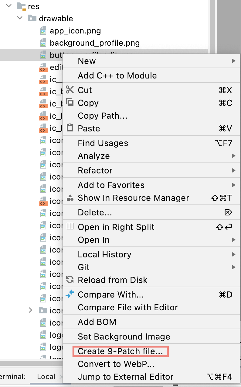
크기를 고정시키는 영역과 내용에 따라 조정되는 영역을 지정해보기 전에 나인패치 이미지를 생성해야한다.
원하는 이미지를 우클릭하여 Create 9-Patch file을 선택하면 쉽게 생성된다!
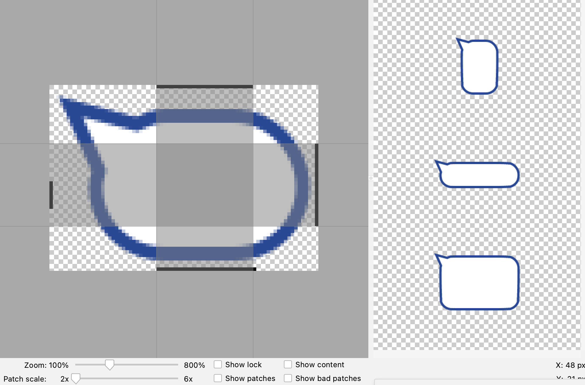
생성된 파일(확장자.9.png)에서 크기를 조절할 부분과 고정할 부분의 범위를 정하여 9등분으로 나눌 수 있다(보통은 9등분으로 나누지만 테두리 드래그로 더 자잘하게 나눌 수 있음).
- Horizontal Patch/Vertical Patch
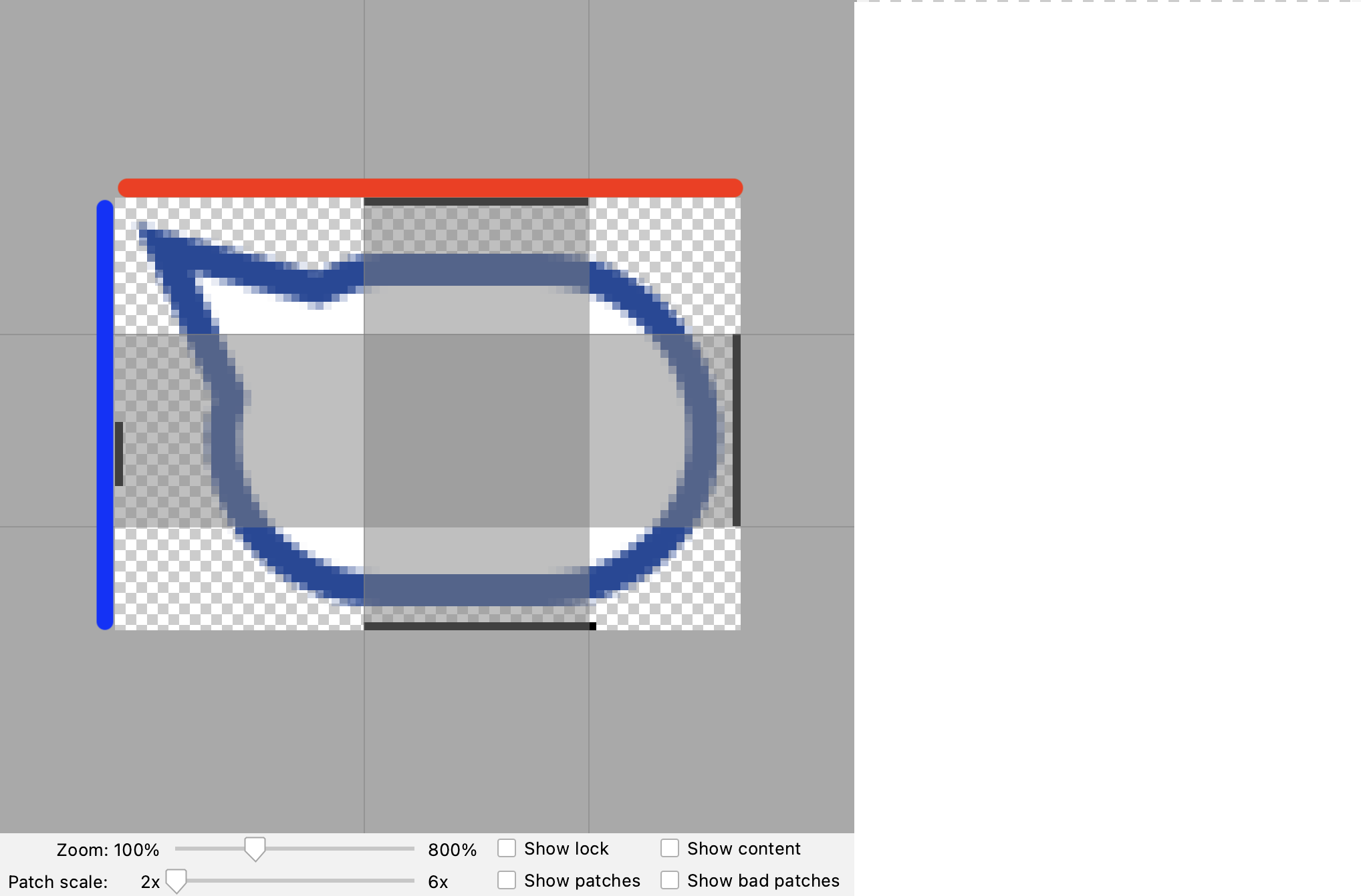
빨간색으로 표시한 윗변이 Horizontal Path, 파란색으로 표시한 왼쪽 변이 Vertical Patch이다.
이 Patch들은 이미지가 늘어났다 줄어들 범위를 지정한다. 따라서 Horizontal Path로 이미지의 가로 가변 범위를, Vertical Path로 세로 가변 범위를 지정해보자.
범위의 경계를 마우스로 드래그하여 늘이고 줄일 수 있다.
- Horizontal Padding/Vertical Padding
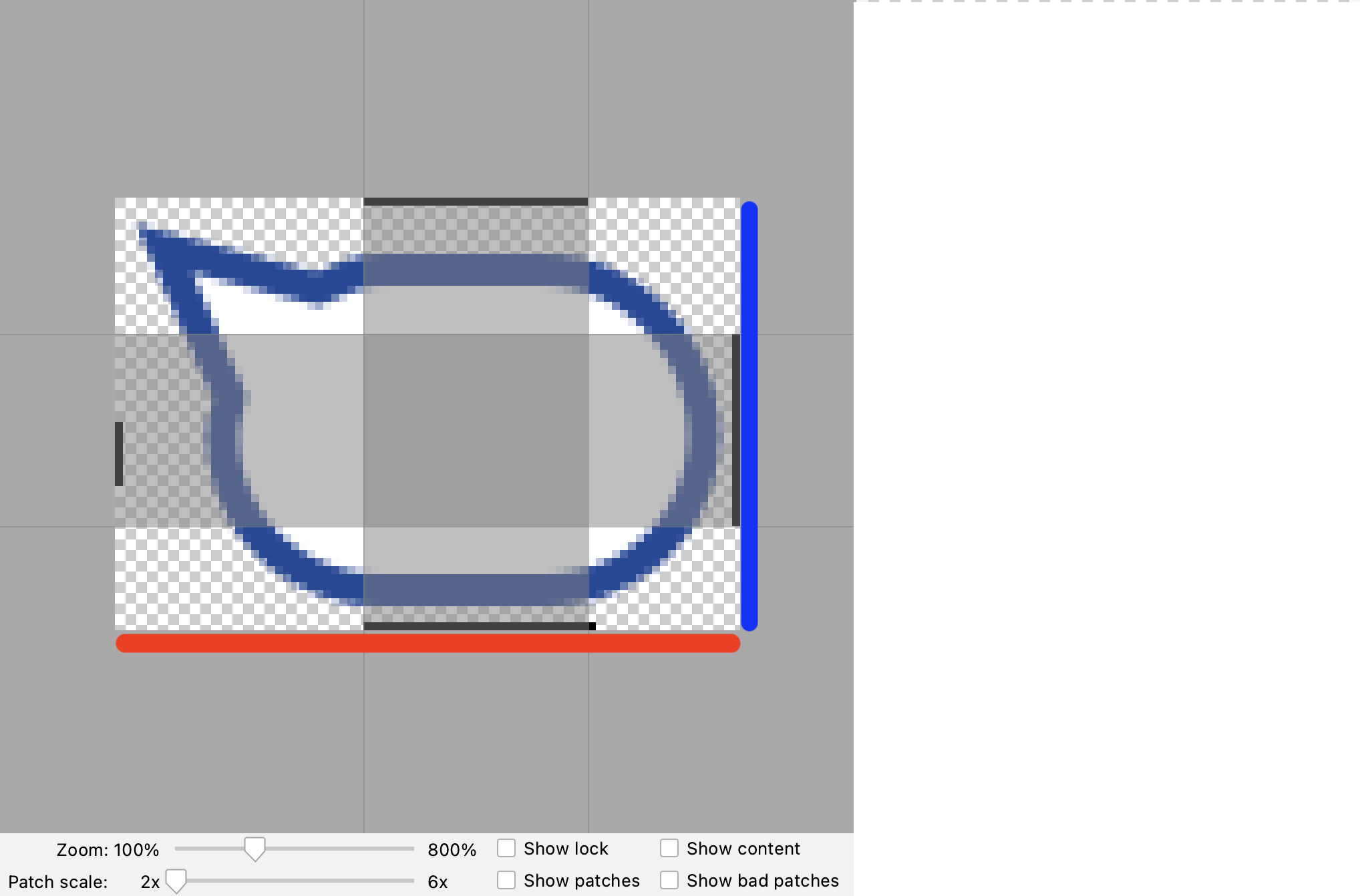
빨간색으로 표시한 아랫변이 Horizontal Padding, 파란색으로 표시한 오른쪽 변이 Vertical Padding이다.
Padding은 content가 들어가는 범위를 지정한다.
예를 들면 TextView에서 text가 들어가는 범위를 지정하는 것이다.
- 적용된 나인패치 이미지 보기
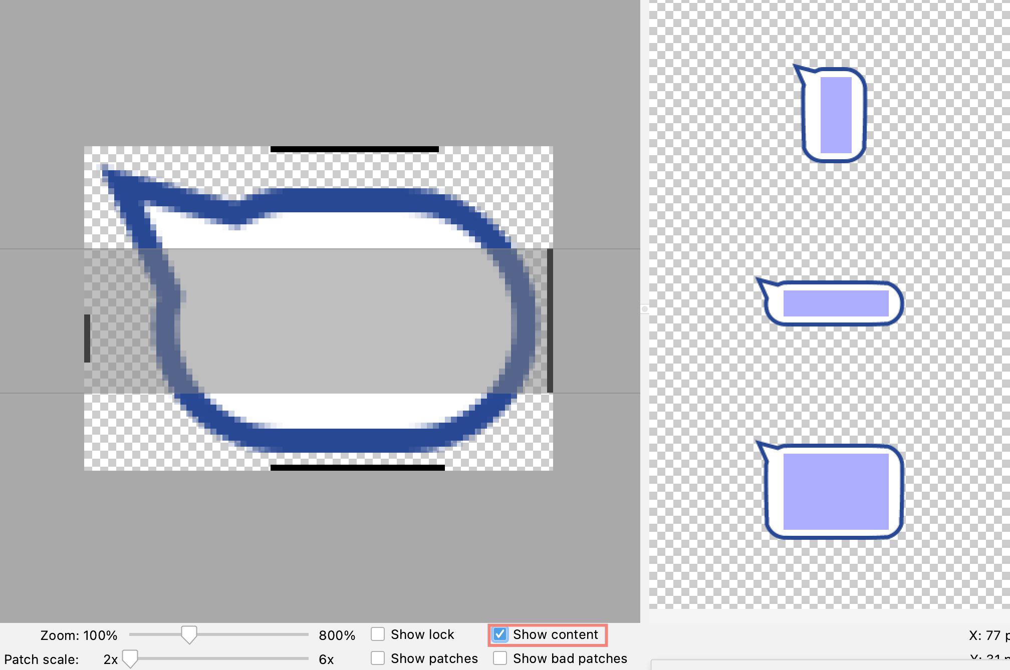
하단의 Show content를 체크하면 적용된 나인패치 이미지를 오른편에서 확인할 수 있다.
3. 활용
<?xml version="1.0" encoding="utf-8"?>
<androidx.constraintlayout.widget.ConstraintLayout
    xmlns:android="http://schemas.android.com/apk/res/android"
    android:layout_width="match_parent"
    android:layout_height="wrap_content"
    xmlns:app="http://schemas.android.com/apk/res-auto"
    android:background="@color/home_policy">
  <!-- 적용하고싶은 나인패치 이미지 이름을 background에 넣어주면 된다-->
    <TextView
        android:id="@+id/txtLeftChat"
        android:layout_width="wrap_content"
        android:layout_height="wrap_content"
        android:maxWidth="265dp"
        android:background="@drawable/icon_bubble_left"
        android:fontFamily="@font/light"
        android:textColor="@color/black"
        android:textSize="@dimen/chatTextSize"
        android:text="채팅 말풍선"
        app:layout_constrainedWidth="true"
        app:layout_constraintTop_toTopOf="parent"
        app:layout_constraintLeft_toLeftOf="parent" />
    <TextView
        android:id="@+id/txtLeftDate"
        android:layout_width="0dp"
        android:layout_height="wrap_content"
        android:orientation="horizontal"
        android:gravity="left"
        android:fontFamily="@font/light"
        android:textSize="@dimen/textSizeSmall"
        android:textColor="@color/black"
        android:text="수요일, 15:06"
        android:layout_marginBottom="5dp"
        app:layout_constrainedWidth="true"
        app:layout_constraintBottom_toBottomOf="parent"
        app:layout_constraintLeft_toRightOf="@+id/txtLeftChat"
        app:layout_constraintRight_toRightOf="parent"/>
</androidx.constraintlayout.widget.ConstraintLayout>
| **Android Studio Bumblebee | 2021.1.1 Patch 2 버전에서는 나인패치로 적용한 범위가 layout의 design으로 표현되지않는다.** |
버전의 문제인지 안드로이드 스튜디오가 아직 나인패치를 design에서 온전히 지원하지 않는 것인지는 모르겠다. 따라서 나인패치가 올바르게 적용된 모습을 보려면 애뮬레이터나 기기에 직접 실행시켜서 확인할 수 있다.
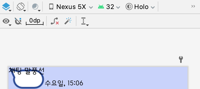
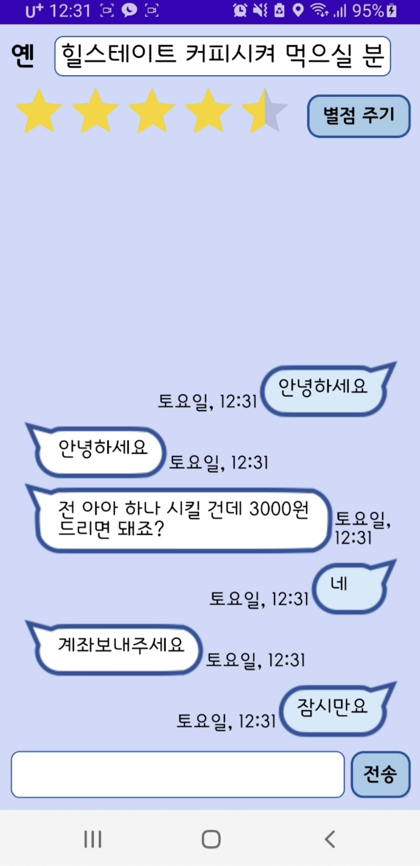
design에선 이렇게 나타나지만 실행 화면에서는 아래의 사진처럼 정상적으로 나타난다.
4. 마무리
나인패치는 포토샵으로도 만들 수 있다고 한다. 각자에게 맞는 방법으로 하면 되겠다.
나인패치가 아닌 xml을 이용해 레이아웃을 작성하는 방법도 있다. 유동적으로 조절되는 부분과 조절되지 않는 부분을 각각 만들어 합치는 식으로 사용되는 것 같다: 참고.


Leave a comment